
The rituals of two: Designing Presence and Memory Bite
A look at our design iterations for MyOnne's core features, focusing on how we translated the abstract idea of 'intimacy' into concrete UI interactions.

When we began designing MyOnne, our whiteboard was covered in a single question: How do we build digital spaces that feel like a shared room, not a transaction? We knew the philosophical answer: remove the metrics, remove the feed, remove the noise. But the design answer proved much harder.
This case study explores the iterative design process behind two of our core interactions: the Presence indicator and the Memory Bite feature. Through wireframes, user testing, and discarding early concepts, we found our way to an interface that supports intimacy without demanding engagement.
Iteration 1: The 'Active Now' Problem
Our earliest prototypes for showing when your partner was online looked exactly like every other messaging app. We used a bright green dot next to their name. We added 'Last seen at 10:42 PM'.

User testing immediately highlighted the flaw. Couples described the green dot not as a feeling of closeness, but as an implicit demand. 'If they are online, why aren't they replying?' The feature was transactional. It measured availability, not presence.
Iteration 2: Ambient Presence
We threw away the timestamps and the green dots. Instead, we explored ambient indicators. What if presence was a soft glow that slowly faded? What if it was just a slight shift in the background color of the chat?
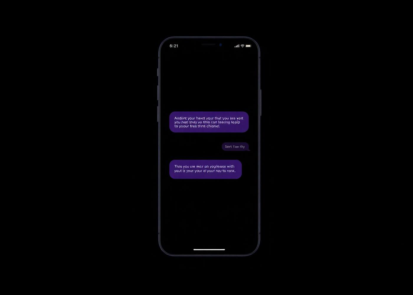
The final design, a subtle, warm gradient that appears when your partner opens the app, changed the dynamic entirely. It became a ritual. Users reported opening the app just to 'leave the light on' for their partner, knowing they would see it later.
We learned that intimacy doesn't need timestamps. It needs warmth.
Designing Memory Bite
Another major challenge was photo sharing. We wanted a way for couples to share quick, unpolished moments: what we called 'Memory Bites'. Early versions included filters, captions, and editing tools.
But the more tools we provided, the less couples shared. They started curating their photos, treating the private chat like a public feed. We had to strip it back.

By removing the edit screen entirely, Memory Bite became instantaneous. It shifted the behavior from 'let me take a good photo' to 'let me share this exact moment'. The ritual of sharing the mundane (a coffee cup, a cloudy sky) was restored by constraining the UI.
The Takeaway
In designing for relationships, less really is more. But getting to 'less' requires rigorous testing and the willingness to throw away industry-standard patterns. We found that when you remove the tools of performative communication, authentic rituals naturally emerge.
Intimacy in UI requires removing metrics and focusing on ambient awareness and unprompted sharing.
Give it a try.
Experience a private space designed exclusively for two people. No feeds. No followers. No algorithms. Just your relationship.
Continue reading
All stories

Stay up to date with MyOnne.
Read about new features, design stories, privacy updates, and the philosophy behind everything we build.
One quiet note a month. No noise. Unsubscribe anytime.